A metal card is one of those products that looks premium before it ever earns it.
And that’s the trap: because it starts life looking expensive, people get lazy about the details. Then the first week of real use happens. Glare kills the text. Coating starts looking tired. Edges feel like they came off a belt sander. The “luxury” becomes “novelty” fast.
One-line reality check: If the card isn’t readable and durable, the card isn’t premium.
The mistakes that quietly wreck a metal card
This is the stuff I see over and over. Not catastrophic errors, worse, subtle ones that keep a card from feeling finished.
– Hairline typography that looks elegant in renders and disappears under overhead lighting
– Low-contrast engraving because someone prioritized “tone-on-tone sophistication” over basic legibility
– Glossy coatings that turn every light source into a mirror (and hide the branding you paid for)
– Over-textured backgrounds that fight the text instead of supporting it
– Edges that aren’t consistent, one corner feels sharp, the next feels rounded, the whole thing feels cheap
– No real-world abrasion testing, so the first wallet encounter becomes the field test you should’ve done in the shop
If you want to avoid these pitfalls and achieve a premium result, it’s worth checking out [metal card design](https://metalkards.com/order/metal-card-design/) resources that prioritize real-world details, not just good looks on your desk.
Hot take: fancy type is usually a mistake on metal
Yes, I said it. Most decorative fonts don’t belong on metal cards.
Here’s the thing: metal surfaces are hostile to fine detail. You’ve got reflections, micro-scratches, oils from hands, and coating behavior that changes how edges read. A delicate serif with thin strokes might look stunning on paper; on a brushed metal substrate it can turn into mush.
Typography that survives the real world
Think like a manufacturer, not a poster designer.
Use type with:
– Sturdy stroke weights (thin hairlines won’t last)
– Clean counters (small interior spaces fill in visually when glare hits)
– Crisp geometry that engraves or prints predictably
Pairing can work, but keep it controlled. A readable sans for the “utility” lines, one distinctive accent face for a name or headline if you really need it. I’ve seen more premium cards ruined by “creative” typography than saved by it.
A few practical rules I actually enforce:
– Keep secondary lines a bit more spaced than you think they need. Metal reflections compress letterforms visually.
– Don’t let lines run long. Aim around 40, 50 characters when you can, because dense lines on reflective material feel cramped fast.
– Align baselines across blocks. Misaligned text on a card reads like a printing error, even when it’s intentional.
And please: test it under normal lighting. Desk lamp. Office fluorescents. Daylight through a window. The card has to work in ugly light, not just “studio light.”
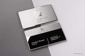
Contrast isn’t optional. It’s the whole game.
You can talk about brand personality all day, but if the card can’t be read in three seconds, you’ve designed a collectible, not a tool.
Reflections are the villain. Gloss and glare wash out detail, especially for tone-on-tone effects that look “subtle” in mockups. Subtle on metal often translates to invisible.
Some combinations tend to behave:
– Dark text + light matte background: boring, reliable, usually the winner
– Laser engraving + controlled depth: durable, but contrast must be designed, not hoped for
– Satin/matte topcoats: often the sweet spot for readability because they reduce specular highlights
Gradients are where things get dicey. They can look incredible, sure, but they also create zones where your text loses contrast. If the gradient passes behind key copy, you’ve built a failure mode into the design.
One more thing: embossed patterns are fun until they cast shadows across small type. Raised textures can slice through strokes visually, especially when the card tilts.
Coatings: the promise and the betrayal
Coatings sell the dream. Coatings also break hearts.
A coating can:
– improve scratch resistance
– reduce fingerprints
– lock in color
– shift the tactile feel (sometimes dramatically)
But coatings can also chip at edges, fade where people touch most, or peel if adhesion is wrong for the substrate and process. In my experience, the edge behavior is where “premium” lives or dies, because that’s where wear concentrates.
If you’re using a magnetic stripe, coatings get even more sensitive. Thick or poorly matched layers can interfere with function, and then you’ve got a card that looks expensive and acts broken. Not a great look.
Now, a specific data point: abrasion testing for coated surfaces is commonly evaluated with standardized rub tests like ASTM D5264 (abrasion resistance of printed materials) and related coating durability methods (ASTM International). If your supplier can’t talk coherently about durability testing, you’re not buying a premium product, you’re buying a guess.
Texture, weight, and finish: the “feel” that people actually remember
People don’t remember your Pantone choice. They remember how the card feels when it hits the table.
Weight should suggest confidence, not clunkiness. Too light and it feels like a gimmick. Too heavy and it becomes annoying to carry (and yes, that affects perceived quality too).
Texture is where you can hide wear and fingerprints without screaming “industrial part.”
A subtle grain or brushed finish does a lot of work:
– masks micro-scratches
– improves grip
– keeps glare manageable
Ultra-polished mirror finishes are high-risk. They look incredible for about five minutes, then they become a fingerprint museum.
Finish that holds up (and doesn’t demand babysitting)
If you want a card that stays sharp:
– go matte or satin over high-gloss in most cases
– prefer engraving that has depth you can feel without weakening the surface
– keep raised elements deliberate and not too aggressive (pockets are harsh environments)
I’ve seen laser engraving outperform printed marks over time simply because it can’t “rub off” in the same way. That doesn’t mean it’s always the right choice, but it’s dependable when the design supports contrast.
Production constraints will rewrite your design if you ignore them
A metal card design isn’t just a design. It’s a manufacturing agreement.
Tooling, batch variation, setup time, substrate availability, these things decide what’s feasible at scale. If you pick a finish that only works when a machine operator is having a perfect day, your consistency will be a mess.
Pricing ties into this more than people like to admit. Higher price tiers should buy you:
– better QC consistency
– more reliable coatings
– tighter edge finishing
– fewer defects and reworks
When pricing is disconnected from user experience, you get the worst outcome: the buyer expects luxury and receives “pretty good.”
quick fixes (the ones that actually move the needle)
Not every card needs a full redesign. Sometimes you just need to stop sabotaging yourself.
Tighten these first:
– Edge consistency: uniform chamfers, clean corners, no “one side feels sharper” weirdness
– Typography discipline: one strong primary face, one support face, locked spacing
– Contrast under glare: if you haven’t tested it under harsh light, you haven’t tested it
– Finish sanity: reduce reflection, reduce fingerprints, avoid coatings that can’t survive wallet abrasion
– Tactile cue placement: a small micro-texture near the logo can feel intentional without complicating the whole surface
Look, a premium metal card is basically a promise you make with physics. Get the surfaces, contrast, and durability working together, and the card feels expensive for years, not just in the unboxing photo.